Landscape

A Different Perspective…

…Is the simplest way to better pictures. Plain and simple.

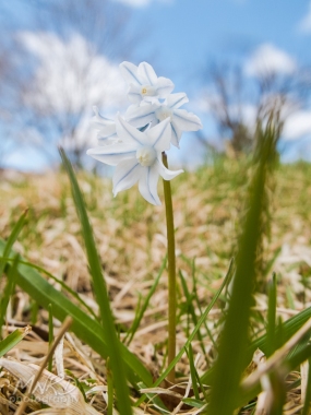
Most images are taken from eye level (booooring). It is what we see on a daily basis. So I ask you this: When was the last time you saw someone crawling around on the ground and, when you inquired (quite concernedly, I would assume) as to what they were doing, they simply replied “I just wanted to see what it looked like from down here.” NEVER! So be that person. Look at the world in ways most people can’t or don’t. Just make sure you have a camera in your hand so you don’t look too crazy.

Spring has sprung-3

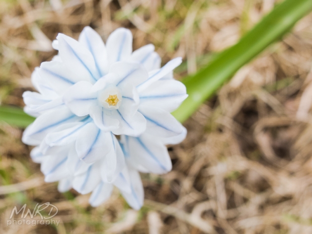
Although better than a typical angle, this shot has been done time and time again.

Spring has sprung-2

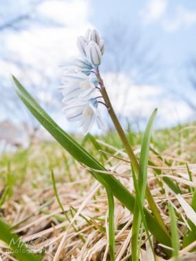
Instead, get down and shoot up to the

Spring Has Sprung

subject to create something different

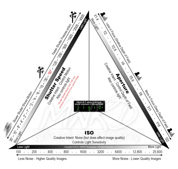
Decoding the Exposure Triangle

Far too often, people get caught up in, or tripped up by, the numbers involved in Photography. f/stops, shutter speeds, ISO values… You might as well be trying to decode the Bermuda Triangle. But once you understand how they work, both individually and together, the world of creative photography opens up like the proverbial oyster. For years, I’ve been teaching students to keep it simple… The more you over-think the numbers, the more frustrating it becomes.

I’ve seen a lot of graphics outlining the Exposure Triangle, but haven’t really come across a comprehensive, yet easy to understand visual representation of it. So, over the past couple of weeks, I’ve been trying to devise a way to illustrate a comprehensive version of the Exposure Triangle, while keeping it simple enough so that it doesn’t overwhelm. Hopefully this helps some of you that may have been struggling with putting it all together.

Click for full size, printable version.

Click for full size, printable version.

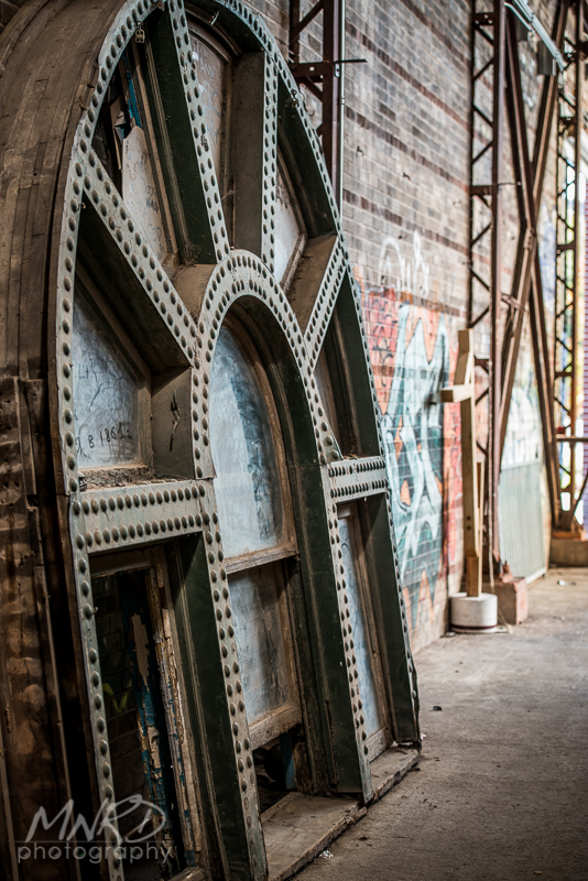
Killing time @ Brickworks

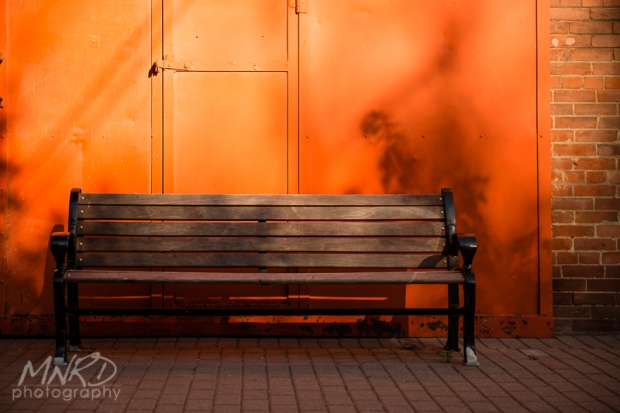
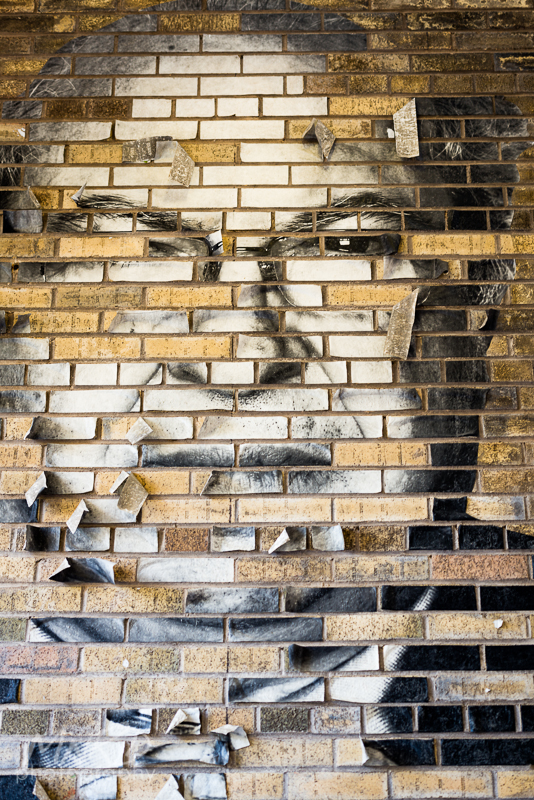
I was on my way home from a meeting downtown earlier this week and traffic was horrible, so I decided to head to the Evergreen Brickworks to kill some time, take some pics and to see what all the hype was about. It’s a pretty neat place with lots of little details to shoot. Here are a few pics from a quiet weekday afternoon…

Follow Me…

Orange Crush

Hidden Entrance

Blue Bird

Contents Unknown…

Facial Apeel

Ten Ton View

Tuna Anyone?

Staggering

Mylo Xyloto

Serpentine Seating

Over Time

Dripping on a narrow depth of field

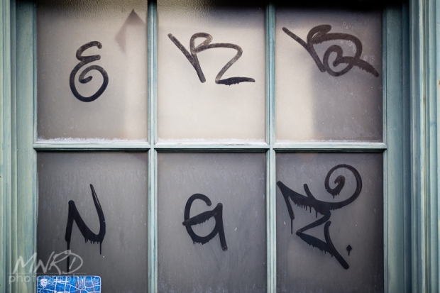
Tagging Panes

Locked Cross

Angularity

The Turning Wheel

Land Shark

Ventilated

Shoot the (Super) Moon

For an event from which we tend to see the same image ad nausea, the SuperMoon on May 5th, 2012 sure garnered a lot of hype. And most of the pictures all look the same (mine included). But just because other people will likely take the same picture doesn’t mean you shouldn’t. Especially new photographers. You can learn a lot by shooting a little white dot in an otherwise vast black nothingness. Seeing as the moon is something that new photographers tend to struggle to capture, here are a few variations of how you can shoot the next Supermoon (or any moon, for that matter.)

  1. You can try Exposure Compensation, but your camera may not give you enough leeway to underexpose enough to retain detail in the Moon.
  2. You can also try Spot or Center-Weighted Metering on the moon itself to retain detail.
  3. However, the best way to learn how your camera works is to use it in Manual mode. Start with settings along the lines of: ISO 100, Aperture around f11 andĀ  a Shutter Speed in the vicinity of 1/30 of a second. Keep in mind that this shutter speed requires a tripod for stabilization (remember my mantra… Below 60, stabilize), which is almost always a must when shooting scenes at night.

The key thing to remember here is that we need to under-expose the shot, because the camera’s light meter will see a primarily black image and try to bring it up to what it thinks is the “proper” exposure, resulting in a black sky with a bright white dot with no detail in it.

Sucker for Simplicity

I don’t know about you, but I’m a sucker for simple, uncluttered images. I’m also drawn to the idea of conveying emotion in a picture. However, you don’t necessarily need a person (or an object, for that matter) in your image to convey emotion. Colours, lines, textures, shapes, patterns, etc. can all work together, or individually, to get a certain feeling across to the viewer. So the next time you are out taking pictures, try to simplify by choosing compositions that are made up entirely of one or more of the elements above.

By eliminating a distinct point of interest in the photo below, the image can portray a feeling of isolation, desolation or, to some people, perhaps serenity or calm.Ā  The idea of art is to evoke different feelings from different people and keeping it simple leaves your photos open to interpretation.

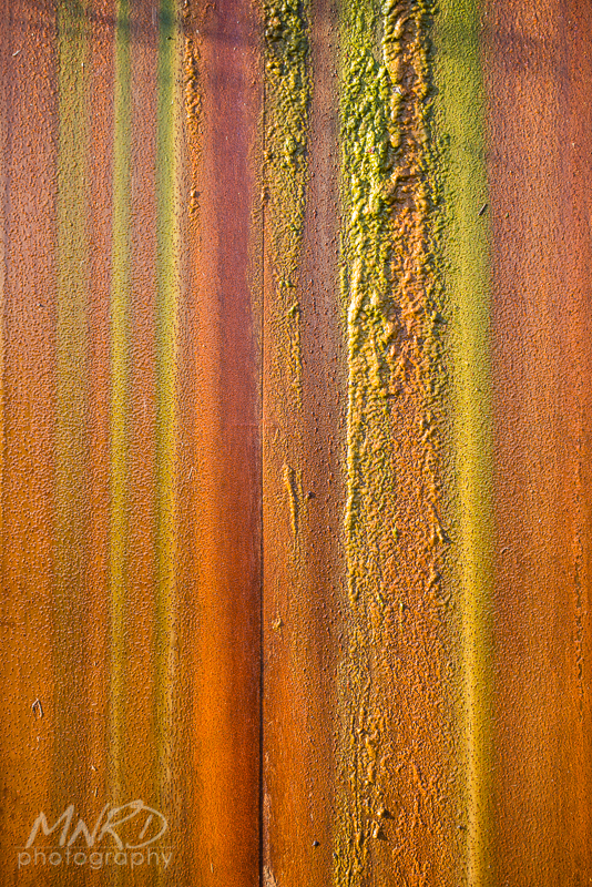
Colour, texture and lines all combine here to make this simple composition more interesting.

Show some Motion!

One thing that new(er) photographers think is out of reach for them is taking pictures of moving subjects. What they don’t realize is that the end result doesn’t necessarily have to be totally sharp or in focus. Playing around with slower shutter speeds not only teaches you how your camera works, but it can create some of the most exciting and interesting results for novices.

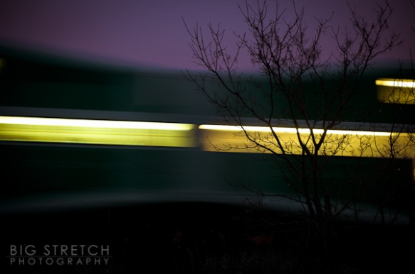
Take the example below. To show motion like this, it is simply a matter of choosing a slower shutter speed (recipe after the pic)…

Show some motion!

To add interest/contrast to this pic, I placed the tree in the foreground so I would have something sharp in my frame to offset the blurriness of the moving train.

Recipe for this shot:

  • Shutter Priority mode (S or Tv)
  • Dial in a shutter speed of 1/8 of a second or slower
  • Use a low (100-400) ISO value to retain detail
  • Stabilize your camera (a tripod is preferred, but anything that will prevent camera movement can be used)
  • Turn on your camera’s 2 second timer to avoid unintended camera movement when you press the shutter button down

Get out and try this, it’s easy and fun. It doesn’t have to be dark out, but try to avoid experimenting with this in bright sunlight, as it can result in overexposed images.

Feel free to leave some feedback below if you try this…

Don’t Hate, Compensate!

When it comes to getting great exposures, the more you leave up to your camera to decide, the more your camera will likely get it wrong. The more you take control, the more you’ll learn and the better the results will be. This is why most Pros shoot in Manual mode, so they have full control over their exposures. If you aren’t quite there yet, here is a tip to start compensating for your camera’s shortcomings when shooting in P, A/Av, or S/Tv modes.

Exposure Compensation allows you to adjust for your camera’s metering system when it gets the reading wrong (although technically, right). This happens most often with an overly bright or overly dark scene, and sometimes it does this as if on a whim. If the camera sees too much dark, it will automatically compensate for it and make it brighter. And if it sees too much brightness, the opposite will occur, you’ll get a darker exposure. Oftentimes the easiest way to correct for this is to use exposure compensation to trick the camera into getting it right.

Example: Have you ever taken a picture only to have the resulting image come out with what seems to be a grey wash over the entire thing (like the image below)? Well, this is your camera’s metering system getting it wrong (although technically, right). It “sees” so much brightness that it figures it should darken it in order to achieve a “middle grey” exposure… Camera Fail! To compensate for this, you’ll want to use some + exposure compensation to brighten it up. How much should I use, you ask? Well, that depends on the overall scene, but a good starting point would be +1. Not enough? Add some more. Too much? Take a bit off. That is the beauty of learning on a digital camera… You don’t have to pay for each exposure like we had to when we shot film.
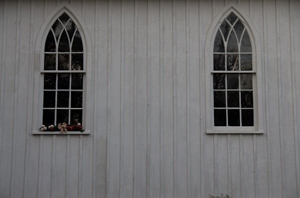
The camera saw so much white in this shot, that it darkened it down to what it thought was the proper exposure...

To compensate for the fact that my camera got the light wrong in my first shot, I dialed in +1 EV (i.e. Exposure Compensation) on my camera and it brightened it right up.

Another example: Have you ever tried to take a picture of the moon? How did that work out for you? Big, bright, blown out white blotch where that nicely detailed moon was supposed to be? Black sky now kind of grey-ish? Yup. Thought so. Usually this is an exercise in frustration for new photographers, but if you can learn to think like your camera, you’ll be able to balance out its shortcomings. In this case, the camera is seeing an abundance of black (the night sky) and a smaller bright spot (the moon), so it thinks the scene is too dark and wants to brighten up the exposure. The fix? Simply use some negative exposure compensation to right the ship.
1/3rd is the Word

There is a magic number in photography (what’s up with this guy and magic?). More specifically, there is a magic fraction in photography, and that number/fraction is 1/3 (one-third). It’s quite amazing how often this number comes up in the world of picture taking. Let’s explore some of the places it comes into play…

The Rule of Thirds. Use it!

First off, and probably the most important, is the “Rule of Thirds”. The rule of thirds is, for all intents and purposes, the cornerstone of a good photograph. Basically, it states that your subject should never be placed in the center of your frame, nor should your horizon be placed right across the middle of the frame. Use the tic-tac-toe looking grid above as a visual representation of the rule of thirds. When you take a picture, you should place your subject along one of the lines in that grid. Alternatively, if it is a small subject, or there is a specific point of interest, like an eye in a close-up portrait, you should place it where those lines intersect (the red dots). If we are talking about a landscape photo, you would place your horizon along one of the horizontal lines, depending on whether you want to accentuate, or draw attention to, the sky or the foreground. It’s a pretty simple concept that will take your photography to the next level.

The next place we find the magic number is in the increments of our shutter speed and aperture. By default, our cameras increase and decrease our exposure values in 1/3 stops. This can be changed on most cameras to increase/decrease in 1/2 stops as well, which is how the aperture used to be marked on lenses with an aperture ring.

Lastly, our magic number has a significant influence when focusing. Wherever you place your focus in a picture, you will have 1/3 in front and 2/3 behind that point in focus. This comes into play in most pictures we take, however it is probably most noticeable when taking landscape pictures. A common misnomer in landscape photography is where you should focus to ensure your picture is sharp from foreground to background. Most people assume that they should either focus on the farthest point in the picture (the horizon, for instance), or halfway into the picture. The correct answer here is (yup, you guessed it) 1/3 of the way into your picture to ensure sharpness all the way through.

Sunny Imposition

There is an epidemic spreading among many upstart photographers, my friends. An epidemic of sunny proportions. Huh? Well, you see, many people new to photography have a tendency to see the sun shining and say to themselves “It’s beautiful out there, nice and sunny. I’m gonna go take some pictures!” (insert sound of game show buzzer here). Wrong answer! Now, I’m not saying you can’t get good results on a sunny day, but your burdening yourself with a sizable handicap before you even get out the door. This sounds crazy, I know, but trust me, bright, midday sun and photography do not a good match make. Let me explain…

Midday sun has a very harsh quality because the sun is at its smallest in the middle of the day, and a small light source produces very harsh shadows, particularly when placed directly overhead. Couple this with the fact that the sun is also at its coolest colour value (roughly 5500 kelvin) in the middle of the day, which tends to take on a cool blue tone as opposed to a nice flattering warm tone, and this equates to a photographic nightmare. Now, there are ways to combat this, namely by adding a circular polarizer to your lens (think of this as sunglasses for your lens). But lets explore another way to help you get better pictures during the day…

Wait for a cloudy day. Yup. You heard me. The reason I say this is that the clouds act as a natural diffuser for the sun, giving you ample light, but spreading it out evenly, eliminating the harshness of direct sunlight. Here’s a real life scenario to help bring it on home… Why do we put lamp shades on lamps? Because they match the decor? No, it’s there to diffuse the light produced by the bulb (again, a very small light source) and spread it around the room. Clouds do the same thing for us outdoors. This results in nice, even lighting that takes on a more saturated look, as opposed to the washed out nastiness of direct sun. Don’t believe me? Have someone stand beside a lamp with the shade on. Now take that shade off and have a look at the difference. Pow! Shadows. Harsh shadows.

I understand why photographers want to go out and shoot when the sun is out and the birds are signing. I really do. So if you prefer to stay a fair-weather shooter, here’s a tip for you… If you don’t have a circular polarizer (as mentioned above), shoot in ManualĀ  or Aperture Priority mode and set your Aperture to f16. This is know as the “Sunny 16” rule. It gives you a great starting point for shooting in direct sunlight.